
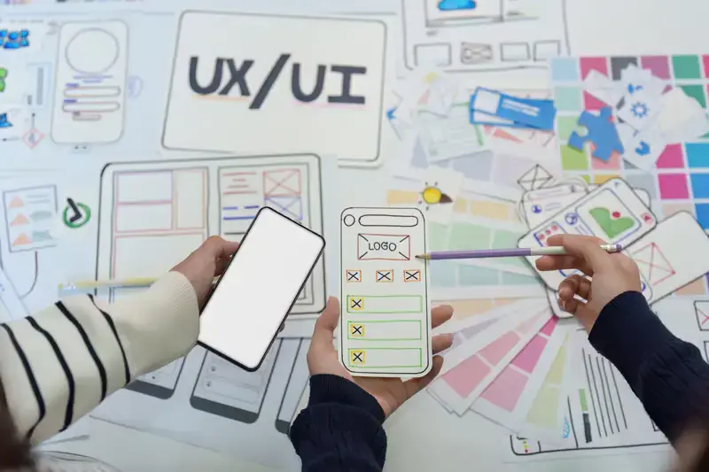
A successful website or application does more than look attractive. It helps people find information, complete tasks, and achieve their goals without unnecessary confusion. Think about the last time you visited a website that looked impressive but made it difficult to find a simple contact form. The colors may have been beautiful, and the images may have been professional, yet the experience probably left you frustrated. This difference between visual appeal and practical usability explains why user interface and user experience design matter so much.
UI design focuses on the visual and interactive elements of a digital product. It includes buttons, typography, colors, icons, forms, menus, and other elements people see and interact with. UX design considers the broader experience. It examines how users navigate a product, understand information, complete tasks, and feel during each interaction. The two disciplines are closely connected. A visually consistent interface cannot compensate for a confusing user journey, while a well-planned experience still needs a clear and attractive interface.
Modern ui ux design prototyping helps connect these disciplines before developers begin building the final product. It gives teams an opportunity to explore ideas, demonstrate interactions, and identify weaknesses while changes are still manageable. Instead of relying on assumptions, designers can create testable experiences and learn how people respond to them.
The strongest digital products are rarely created through visual decisions alone. They grow from research, thoughtful planning, practical experimentation, and continuous improvement.
Understanding the Human Side of Interface Design
Good design begins with understanding the people who will use a product. Designers sometimes make decisions based on personal preferences. They may assume that users prefer a particular menu style, understand a technical label, or recognize an unfamiliar icon. These assumptions can lead to interfaces that work well for the design team but create difficulties for actual visitors.
User-centered design takes a different approach. It considers the expectations, abilities, motivations, and limitations of real people. A first-time visitor may need clear guidance, while an experienced user may prefer shortcuts and faster navigation. Someone browsing on a mobile phone may interact differently from someone using a large desktop screen.
Research helps reveal these differences. Interviews provide insight into user expectations, while surveys can identify broader patterns. Website analytics show where visitors arrive, which pages they use, and where they leave. Direct observation can reveal problems that users may struggle to explain in a questionnaire.
For example, an online store might discover that visitors frequently abandon their shopping carts. The initial assumption could be that product prices are too high. However, usability testing may reveal that the checkout form asks for unnecessary information or displays unexpected delivery charges too late. The real problem is not the product. It is the experience surrounding the purchase.
This is why ui ux design prototyping should be connected to research rather than treated as an isolated visual exercise. When designers understand user behavior, they can create prototypes that address genuine problems instead of simply demonstrating attractive screens.
Turning User Research Into Clear Design Priorities
Research produces valuable information, but collecting feedback is only the beginning. Designers must translate observations into practical priorities. A user may report that a website feels confusing, but the design team needs to understand which part of the experience creates that confusion.
Start by identifying the tasks users want to complete. These might include finding a product, comparing services, booking an appointment, creating an account, or accessing support. Next, examine the obstacles that prevent users from completing those tasks. Are important links difficult to find? Are instructions unclear? Does the process require too many steps?
Personas and user journey maps can help organize these findings. A persona represents a meaningful user group, while a journey map describes the stages a person moves through when interacting with a product. Both tools can help teams understand where design improvements will have the greatest impact.
Expert advice is to prioritize problems according to their frequency, severity, and effect on important tasks. A small visual inconsistency may be less urgent than a broken navigation path that prevents visitors from reaching essential information. Clear priorities keep design discussions focused and make research more useful.
Building Accessible Experiences for Different Abilities
Accessibility is an essential part of modern interface design. People interact with digital products in different ways. Some use screen readers, keyboard navigation, voice controls, or magnification tools. Others experience temporary limitations because of an injury, poor lighting, a noisy environment, or a slow internet connection.
Designers should consider readable text, sufficient color contrast, descriptive form labels, clear focus indicators, and meaningful headings. Interactive elements should be understandable without depending entirely on color or visual position. Buttons need clear labels, and error messages should explain how users can correct a problem.
Accessibility guidelines such as the Web Content Accessibility Guidelines provide an established framework for improving digital experiences. However, following technical recommendations should not replace testing with actual users. A design may meet certain formal requirements and still contain confusing instructions or difficult navigation.
Accessibility should influence early ui ux design prototyping decisions. Testing keyboard interactions, text scaling, and screen-reader behavior during development is usually more practical than trying to correct major accessibility problems after a product has been completed.
Interface Architecture That Makes Every Interaction Feel Natural
A digital interface needs an understandable structure. Even a simple website can become difficult to use when information is scattered across unrelated pages or important actions are hidden behind unclear menus. Interface architecture organizes content and functions so users can understand where they are and what they can do next.
Information architecture is concerned with the organization and labeling of content. It determines how pages relate to one another and how users move between sections. A business website, for example, may organize its main navigation around services, industries, resources, company information, and contact options. The structure should reflect how visitors think about the information rather than how the company internally organizes its departments.
Visual hierarchy then helps users understand which elements deserve attention. Size, spacing, contrast, alignment, and positioning can communicate importance. A page heading should be distinguishable from supporting text. A primary action should be recognizable without competing with several equally prominent buttons.
Consistency also matters. When similar elements behave differently across pages, users must repeatedly learn how the interface works. Consistent buttons, form fields, navigation patterns, and feedback messages make interactions more predictable.
Responsive design adds another layer of consideration. A layout that works on a desktop may become crowded on a mobile screen. Designers should consider how content rearranges, how menus behave, and whether important actions remain accessible at different screen sizes. A responsive interface is not simply a smaller desktop layout. It is an experience adapted to the available space and interaction method.
UI UX Design Prototyping: Turning Ideas Into Testable Experiences
Prototyping allows designers to explore how a digital product might look and behave before the final version is developed. It transforms abstract ideas into something people can examine, navigate, and evaluate. A prototype can be a simple collection of connected wireframes or a detailed interactive model that closely resembles the intended product.
The main purpose of ui ux design prototyping is to reduce uncertainty. A design team may believe that a three-step registration process is easy to understand, but a prototype can reveal whether users actually complete it without confusion. Similarly, a product team may assume that a particular navigation structure is intuitive, only to discover that visitors repeatedly select the wrong option.
Prototypes also improve communication. Designers can show developers how an interaction should work, while product managers and stakeholders can review the proposed experience before significant development resources are committed. This reduces the risk of building features that later require extensive redesign.
Different prototype levels serve different purposes. Low-fidelity prototypes focus on structure and basic navigation. High-fidelity prototypes include more realistic visuals, content, and interactions. The appropriate level depends on the questions the team wants to answer.
From Rough Sketches to Interactive Models
The process often begins with rough sketches. These can be created on paper or through simple digital layouts. Their purpose is to explore ideas quickly rather than produce polished visuals. Designers can test different page arrangements, navigation patterns, and content priorities without investing too much time in details.
Wireframes provide a more organized representation of the interface. They show the placement of headings, images, buttons, menus, and content areas. At this stage, designers can evaluate page structure and user flow while avoiding distractions caused by colors or decorative styling.
Interactive prototypes introduce clickable elements and simulated behavior. Users may be able to open menus, move between screens, complete sample forms, or follow a checkout process. These interactions make it easier to evaluate whether the experience feels logical.
High-fidelity prototypes go further by representing the intended visual design. They may include final typography, colors, spacing, component states, and realistic content. They are especially useful when teams need to evaluate detailed interactions or communicate a design direction before development.
An important expert recommendation is to avoid polishing too early. If the basic user journey is unclear, spending hours adjusting shadows, gradients, and icon sizes will not solve the underlying problem. Validate the structure first, then invest in visual refinement.
Choosing the Right Prototyping Tools and Workflows
Several design platforms support interface creation, collaboration, and interactive prototyping. Figma is widely used for collaborative interface design and shared component libraries. Adobe XD has also been used for interface design and prototyping, although teams should check its current product support and availability before selecting it for a new workflow. Other tools may be useful for specialized interaction design, advanced animation, or developer-focused prototypes.
The best tool depends on the project. A small website redesign may require only wireframes and basic clickable interactions. A complex application with multiple user roles may need more detailed flows, reusable components, and careful version management.
Teams should also consider collaboration requirements. Designers may need to share prototypes with product managers, developers, clients, and research participants. Clear naming conventions and organized project files make feedback easier to manage.
A strong ui ux design prototyping workflow should include a clear purpose for each prototype. Before creating one, decide which questions need answers. Is the team evaluating navigation? Testing a registration flow? Comparing two layouts? Reviewing a complex dashboard? A focused prototype produces more useful feedback than a large collection of screens without a specific objective.
Usability Testing That Reveals What Design Files Cannot
A prototype can look convincing to its creator and still be difficult for someone else to use. Usability testing helps identify this difference. It involves asking representative users to complete realistic tasks while researchers observe their behavior and collect feedback.
A test might ask someone to find a particular service, change an account setting, or purchase a product. The goal is not to teach participants how the interface works. It is to understand whether the design helps them complete the task naturally.
Moderated testing involves a facilitator who can observe participants and ask follow-up questions. Unmoderated testing allows users to complete assigned tasks independently, often through a research platform. Both methods have advantages. Moderated sessions provide deeper explanations, while unmoderated tests can collect feedback from a wider group with less direct involvement.
Designers should pay attention to hesitation, repeated clicks, navigation mistakes, abandoned tasks, and requests for clarification. These behaviors can reveal problems that participants may not mention directly. A user might say that a form was easy, even though they spent several minutes searching for the correct field.
Testing should not be treated as a final approval stage. It works best as an ongoing activity. Early testing can identify structural issues, while later testing can evaluate visual details and interaction behavior.
The most valuable results often come from small, repeated improvements. A confusing label can be rewritten. A hidden action can be moved. A lengthy process can be simplified. After making changes, designers can test the updated version to see whether the experience has improved.
Design Systems That Keep Digital Products Consistent
As digital products grow, maintaining consistency becomes more challenging. A website may contain dozens of pages, while an application may include hundreds of screens and interaction states. If every designer creates buttons, forms, colors, and spacing rules independently, the product can gradually become inconsistent.
A design system provides shared standards for visual and interaction decisions. It typically includes design tokens, typography rules, color palettes, spacing scales, reusable components, patterns, and documentation. It gives designers and developers a common reference for building and maintaining the product.
Design systems also support efficiency. Instead of recreating a button on every screen, designers can use a shared component. When the component needs an update, the team can apply the change consistently across relevant parts of the product.
A design system should not be viewed as a collection of attractive UI elements. It is a practical framework that connects design decisions with implementation. It can also improve accessibility by establishing consistent requirements for contrast, focus states, labels, and component behavior.
Reusable Components Without Restricting Creativity
Reusable components are individual interface elements that can be used in multiple places. Common examples include buttons, input fields, cards, navigation bars, alerts, and dropdown menus.
A well-designed component includes more than its default appearance. A button may need hover, focus, pressed, disabled, and loading states. A form field may require empty, active, completed, and error states. Defining these variations helps prevent inconsistent behavior.
Components should also allow appropriate flexibility. A primary button may appear in different sizes or contexts, but its core visual language should remain recognizable. Too much variation weakens consistency, while too little flexibility can make the system difficult to use.
During ui ux design prototyping, reusable components help designers build realistic screens more efficiently. They also make it easier to explore alternative layouts without recreating every element.
Maintaining Design Systems as Products Evolve
A design system needs ongoing maintenance. New product features, accessibility requirements, brand updates, and technical changes can all create reasons to revise existing components.
Clear documentation helps teams understand how and when to use each component. It should explain intended behavior, available variants, accessibility considerations, and implementation guidance. Without documentation, even a well-built component library can become difficult to use.
Ownership is equally important. Teams should know who reviews proposed changes, approves new components, and communicates updates. Version history helps developers understand when a component has changed and whether an existing implementation needs attention.
A useful approach is to review the system during regular product development rather than waiting for a major redesign. This keeps the library connected to actual product needs and reduces the accumulation of inconsistent patterns.
Connecting Design Decisions With Front-End Development
Design and development are closely connected, but they involve different ways of thinking. Designers focus on user behavior, visual presentation, and interaction patterns. Developers consider technical structure, performance, responsive behavior, accessibility implementation, and maintainability.
Problems can arise when these teams work separately for too long. A prototype may show an animation that is difficult to implement efficiently. A layout may depend on content that changes in length. A button may have a visual state that is not included in the development specification.
Early collaboration helps identify these issues before they become expensive. Developers can explain technical constraints, while designers can clarify the intended experience and suggest alternative solutions.
A good handoff should include more than screenshots. Developers may need component specifications, spacing values, typography details, responsive behavior, interaction states, and notes about validation or error handling.
The ui ux design prototyping process becomes more effective when designers treat developers as collaborators rather than people who simply reproduce finished screens. Shared discussions help preserve the purpose behind design decisions while allowing the team to find practical implementation methods.
It is also important to compare the developed product with the approved prototype. Small differences may appear during implementation. Some are unavoidable, but others can affect usability or consistency. A design review before release helps identify important gaps and gives the team an opportunity to correct them.
Measuring Design Quality Through Real User Outcomes
A successful design should produce meaningful improvements in the user experience. Visual quality is important, but it does not explain whether people can complete tasks or understand the product.
Task completion rate is one useful measure. It shows how often users successfully finish a specific activity. Time on task can reveal whether an interaction is unnecessarily complicated, although faster completion is not always better if users are rushing or making mistakes.
Error rates provide another perspective. If visitors repeatedly enter incorrect information or select the wrong navigation option, the interface may need clearer instructions or better feedback. Conversion rates can help businesses understand whether a landing page or checkout process supports its intended goal.
Qualitative feedback adds context to these measurements. Interviews and usability sessions can explain why users abandon a process or struggle with a particular feature. Analytics may identify a problem, while direct observation helps explain its cause.
Metrics should always be interpreted in context. A longer session does not necessarily indicate greater engagement. It might mean that users are struggling to find information. Similarly, a high click rate does not automatically mean that a button is useful.
The purpose of ui ux design prototyping is not simply to produce a model that looks impressive. It is to create an experience that performs well when real people use it. Combining quantitative data with qualitative insights gives teams a stronger basis for design decisions.
Avoiding the Design Habits That Create Unnecessary Friction
Some design problems appear because teams focus too heavily on appearance or move too quickly into development. One common issue is visual overload. Too many colors, competing headings, animations, and prominent buttons make it difficult for users to recognize what matters.
Unclear calls to action create another problem. A button labeled with vague language may not explain what happens after a click. More specific wording helps people understand the next step and reduces uncertainty.
Inconsistent components can also damage the experience. If similar forms behave differently across pages, users must repeatedly adjust to new interaction patterns. A design system helps prevent this, but only when teams use and maintain it properly.
Accessibility mistakes are equally important. Low contrast, missing labels, tiny text, and keyboard navigation problems can prevent people from using essential features. These issues should be considered during design reviews and usability testing.
Another common mistake is relying entirely on stakeholder opinions. Internal feedback is useful, but it cannot replace evidence from actual users. A design that receives enthusiastic approval in a meeting may still create difficulties during real interactions.
The best way to reduce these problems is to maintain a disciplined process. Research should guide priorities, prototypes should test assumptions, and design reviews should examine both visual quality and usability. Teams should also document important decisions so that future updates do not reintroduce previously solved problems.
Building a Design Practice That Improves With Every Release
Great digital experiences are not created in a single design session. They develop through a cycle of research, planning, experimentation, testing, and refinement. Each stage contributes something important. Research reveals user needs. Interface architecture organizes information. Prototypes make ideas testable. Usability testing identifies friction. Design systems preserve consistency, while development collaboration turns approved concepts into working products.
The most effective ui ux design prototyping process is therefore connected to the entire product lifecycle. It does not stop when a prototype receives approval or when a website goes live. Real users may reveal new needs, technology may introduce new possibilities, and business priorities may change.
Expert designers understand that improvement requires both creativity and discipline. They explore new ideas but remain willing to question their assumptions. They care about visual details but never allow appearance to overshadow usability. They also recognize that accessibility, performance, and clear communication are essential parts of a complete experience.
For businesses, investing in this process can improve more than the appearance of a website or application. It can reduce avoidable development rework, support customer satisfaction, strengthen brand consistency, and make digital services easier to use.
Ultimately, good UI and UX design is about respect for the user’s time and attention. When people can understand a product, move through it confidently, and accomplish their goals without unnecessary effort, the design is doing its job. That is the real value of thoughtful interface design, effective prototyping, and a well-maintained design system.
Frequently Asked Questions
What is UI UX design prototyping?
UI UX design prototyping is the process of creating an interactive or visual model of a digital product before final development. It helps designers explore layouts, test user journeys, evaluate interactions, collect feedback, and identify usability problems early. Prototypes can range from simple wireframes to realistic, clickable product experiences.
Which tools are commonly used for UI UX design prototyping?
Figma is widely used for interface design, interactive prototypes, and collaborative workflows. Other tools may support specialized animation, advanced interaction testing, or developer handoff. The right choice depends on project complexity, team experience, collaboration needs, and the level of detail required for testing.
Why are design systems important in UI and UX design?
Design systems create consistency through shared colors, typography, spacing rules, reusable components, and interaction patterns. They help teams build products more efficiently and reduce visual differences between screens. A maintained design system also supports accessibility, simplifies updates, and improves collaboration between designers and developers.